- Home
- Apps
- Apps Features
- Cleartrip's Sunit Singh Says Ola to a New Design Frontier
Cleartrip's Sunit Singh Says Ola to a New Design Frontier

Taxi aggregation is increasingly becoming a big business across the globe, with Uber, perhaps the most recognisable name in the field, said to be valued at $40 billion. Despite a few hiccups, the space has seen plenty of growth in India as well, as Uber finds itself competing against local players like Ola Cabs and TaxiForSure, with new ones like Cabzo also joining the fray.
While there are other ways to book a cab, at the centre of each of these services is a mobile app. The basic feature that these apps offer is the same, and as the space becomes increasingly crowded, it can become hard to differentiate one app from the other. Companies can differentiate themselves on price or the number of third-party wallets (payment methods) the app supports, but in many ways, the real customer experience is in actually using the app.
For mobile apps, form is not separate from function, and good design can go a long way in having a positive experience with the service. Even though mobile phone screens seem to keep getting bigger with time, the fact remains that our smartphones are still pretty small compared to a desktop screen. You need a completely different way to navigate and use different functions.
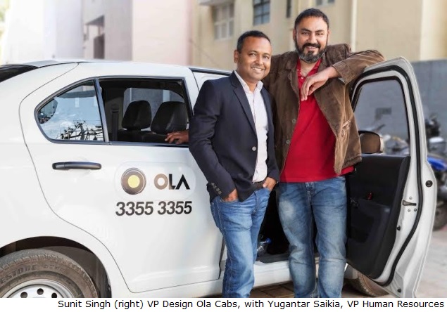
The Uber app stands out amongst the crowd for its design and in-app experience, and in our use, the one Indian company that comes closest to the same simplicity and ease is Ola Cabs. With this in mind, when we heard that Ola Cabs had hired Sunit Singh, the Lead Designer at Cleartrip - another India company that's know for its design sense - we couldn't wait to find out what was cooking at the Gurgaon-based company.
Cleartrip has used good design to differentiate itself in the crowded online travel aggregator business, a world usually associated with popup advertisements and seemingly endless marketing emails. Ola operates in an equally crowded market, and getting Singh on board as Vice President, Design signals the company realises the importance of design and user experience.
Singh had been with Cleartrip for nearly five years now, and was heavily involved with its mobile apps as well as the last major redesign of Cleartrip. The company's offerings stand out for their minimalistic approach, and Singh says that the role of the designer is not to add, but to subtract.
"A good designer doesn't add things, but removes the unnecessary parts," he says.
In an earlier interview Singh has repeated the same mantra, and explained: "Hard decisions are a part and parcel of every business but we rely on market data to minimise the friction that designers feel, as much as possible."
(Also see: Crystal clear: How Cleartrip uses design as a differentiator in a crowded market)
At Cleartrip, Singh had talked to us about how the company was in-tune with thinking about design, and so when it was time to find a new company to work with, he wanted to continue to work in a place that cared about design.
"Before joining, I was already a heavy Ola user, and one thing I liked about them is that before the apps were launched, they had a very good mobile website," says Singh. "Not many people did a good job of that - I think in India it might just have been us [Cleartrip] and Ola who made a good mobile Web experience. That gave me a lot of confidence, and I could see that [in Ola] someone was looking at design."
"Bhavish [Aggarwal, CEO Ola Cabs] clearly understands design," he adds, "and I wouldn't be here if I didn't have the comfort level... I've been in an environment where I didn't have to fight about design, and that was the first thing I considered when joining."
Aggarwal says he's been heavily involved with the design side of things so far, but he's only too happy to hand over the reins.
"Design is central to building a better customer experience," says Aggarwal. "I've been very involved in the design of our apps before Sunit [Singh] came onboard. Now I'm looking forward to learning a lot more from him about how we can do better."
Aggarwal, who says he likes the design for Cleartrip and Google Maps for their "clean interfaces" and "superb functionality" tells us that he was a heavy user of Cleartrip, which is what made him reach out to Singh.
"We at Ola loved what he had done at Cleartrip," says Aggarwal. "Their app is very intuitive and natural to use for the user and shows that they took every small detail with a lot of seriousness and built with a lot of care."
There are some obvious differences between Cleartrip and Ola though. For one thing, Cleartrip has a mixed audience, with half or more people still coming via the desktop. Ola's focus is on mobile, and the experience on the devices is perforce different.
The other big difference - as Singh points out to us - is that most people don't book a plane or even train ticket every day.
"Travel is a less frequent activity than booking a cab," says Singh. "And when you are booking a flight, the flowthrough is very different from booking a train. There are different types of complication." On the other hand, booking a cab is a daily activity, and sometimes even more than daily.
"Ola is a very high frequency, on-demand service," says Singh. "So you have to design for a customer who will get addicted." The goal is to make something that is really intuitive to use, and doesn't require the user to waste time entering data.
"Within the category, I'd say that Uber has obviously also done a good job," says Singh. "If you can mirror real world behaviour [like hailing a taxi on the road] and make it even simpler, then you're doing a good job."
This manifests in a number of different ways. "Design is more than just the UI of the app," says Aggarwal. "It is reflected in the choices made while thinking about the product and customer experience we want to build. Whatever we're building has to improve the way customers fulfil their needs today. The overall experience for the customer should be better and simpler than other alternatives."
Singh agrees, and says that being successful in the pursuit of simplicity means leveraging the power of the medium fully. There is no point, he tells us, in trying to replicate a desktop experience when the strengths and weaknesses of mobile are different.
"A lot of the work you need, can be done for you by the mobile," says Singh. "The phone can act as the wallet, it has your location data, [and after you log in to the app] it can be used to communicate [via SMS]. On a desktop, you'd have to fill all this information in, but a good mobile app will use all these functions to make life simpler."
The challenge instead lies in designing to maintain your brand identity across multiple mobile platforms. Apple, Google and Windows all have their own design aesthetic, and forcing one onto the other can be a jarring experience that confuses the user.
(Also see: Sorry Google, Material Design Just Doesn't Belong on iOS)
Singh agrees with us, and says, "you need to keep both your brand identity and the platform's needs in mind."
"The platform's design guidelines are very important for usability," says Singh. "So you want to maintain your own identity through subtle tweaks. Instead of making a single design that runs on all platforms, you need to design separately for each platform so that you can leverage the nuances of each."
"For example, iOS has certain patterns you want to use, and even go beyond," he adds. "The same is true for Android and Windows phone. You don't want to get hung up on your single design, and it's okay that your apps look a little different on the different platforms. A single user is not typically switching between all the mobile platforms. There should be consistency between the core style of the desktop and mobile apps, but the specifics need to be tailored to the strength of the platform."
At the end of the day, it all boils down to maintaining a single theme, and for Ola and Singh, that is simplicity.
"To design a good mobile app, you need to think about the device capabilities, and build experiences around them," he adds. "The constraint of a small screen is an opportunity if you firmly believe in keeping things simple. Design means dropping things people don't need."
For the latest tech news and reviews, follow Gadgets 360 on X, Facebook, WhatsApp, Threads and Google News. For the latest videos on gadgets and tech, subscribe to our YouTube channel. If you want to know everything about top influencers, follow our in-house Who'sThat360 on Instagram and YouTube.
Related Stories
- Galaxy S24 Series
- MWC 2024
- Apple Vision Pro
- Oneplus 12
- iPhone 14
- Apple iPhone 15
- OnePlus Nord CE 3 Lite 5G
- iPhone 13
- Xiaomi 14 Pro
- Oppo Find N3
- Tecno Spark Go (2023)
- Realme V30
- Best Phones Under 25000
- Samsung Galaxy S24 Series
- Cryptocurrency
- iQoo 12
- Samsung Galaxy S24 Ultra
- Giottus
- Samsung Galaxy Z Flip 5
- Apple 'Scary Fast'
- Housefull 5
- GoPro Hero 12 Black Review
- Invincible Season 2
- JioGlass
- HD Ready TV
- Laptop Under 50000
- Smartwatch Under 10000
- Latest Mobile Phones
- Compare Phones
- Samsung Galaxy C55
- Blackview Hero 10
- Oppo K12
- Vivo Y200i
- Huawei Pura 70 Pro
- Huawei Pura 70
- Vivo V30e
- Itel Super Guru 4G
- Asus ZenBook Duo 2024 (UX8406)
- Dell Inspiron 14 Plus
- Realme Pad 2 Wi-Fi
- Redmi Pad Pro
- boAt Storm Call 3
- Lava ProWatch Zn
- Samsung Samsung Neo QLED 8K Smart TV QN800D
- Samsung Neo QLED 4K Smart TV (QN90D)
- Sony PlayStation 5 Slim Digital Edition
- Sony PlayStation 5 Slim
- Voltas 1.5 Ton 3 Star Split AC (183 Vectra Elegant 4503545)
- Hitachi 1.5 Ton 5 Star Inverter Split AC (RAS.G518PCBISF)


