- Home
- Mobiles
- Mobiles News
- Apple WWDC 2013: iOS 7 to come with revamped app icons, new Black and White themes: Report
Apple WWDC 2013: iOS 7 to come with revamped app icons, new Black and White themes: Report

(Also see: WWDC 2013 keynote live blog)
According to the website, staying in line with previous rumours, the icons on the updated OS will certainly be flat. Rumours pointing to a flat yet familiar UI have surfaced time and again through various sources.
Adding to that, iOS 7 will also have five grey and white dots to represent the cellular signal instead of the usual bars. The font of the interface also seems to have changed with something thinner and similar to Helvetica Nueue Ultra Light. It is interesting to note that posters of the number '7' that were up for WWDC seem to have used a similar font, as well. Along with this, the site suggests that the bottom dock bar has been replaced by a single thin transparent line.
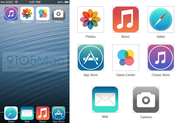
A look at the icons in the mock-up screen certainly shows revamped icons for quite a few apps. Going flat has hence also changed many of the familiar icons.
The familiar sunflower on the Photos icon is now replaced by a flower like colour wheel. Music with its orange back appears simply flattened. The compass icon for Safari is retained, but changed into a more circular icon. Mail stays almost the same but with the clouds gone and the flatness applied. The App Store also looks the same, just flatter and without the glow like effect in the back. The most significant change can be seen in the Game Center icon where the four game icons appears to have been replaced by four different coloured circles. In the graphical representation, iTunes is still pink and purple but like the App Store icon it has lost its glow like effect. The lens in the camera icon has also been replaced with a full camera in a gray gradient.
Previous rumours of iOS 7 bringing "black and white" themes might be true as well. According to the report, there happen to be two colour schemes for many of Apple's core apps. When in the "Black mode", the keyboard is black with gray letters, while in the "white mode" it has gray keys with white letters.
If we take a look at this mock up, the UI is certainly much more minimalistic. A major redesign for iOS has been on the cards for a while now. But whether the change will be this radical is something that we will have to wait and watch when Apple previews the OS later in the day.
Also see: 5 things to expect at Apple's WWDC starting Monday
Image Credit: 9to5Mac
For the latest tech news and reviews, follow Gadgets 360 on X, Facebook, WhatsApp, Threads and Google News. For the latest videos on gadgets and tech, subscribe to our YouTube channel. If you want to know everything about top influencers, follow our in-house Who'sThat360 on Instagram and YouTube.
Related Stories
- Galaxy S24 Series
- MWC 2024
- Apple Vision Pro
- Oneplus 12
- iPhone 14
- Apple iPhone 15
- OnePlus Nord CE 3 Lite 5G
- iPhone 13
- Xiaomi 14 Pro
- Oppo Find N3
- Tecno Spark Go (2023)
- Realme V30
- Best Phones Under 25000
- Samsung Galaxy S24 Series
- Cryptocurrency
- iQoo 12
- Samsung Galaxy S24 Ultra
- Giottus
- Samsung Galaxy Z Flip 5
- Apple 'Scary Fast'
- Housefull 5
- GoPro Hero 12 Black Review
- Invincible Season 2
- JioGlass
- HD Ready TV
- Laptop Under 50000
- Smartwatch Under 10000
- Latest Mobile Phones
- Compare Phones
- Vivo V30e
- Itel Super Guru 4G
- Huawei Pura 70 Pro+
- Huawei Pura 70 Ultra
- Tecno Camon 30 Premier 5G
- Motorola Edge 50 Fusion
- Oppo A1i
- Oppo A1s
- Asus ZenBook Duo 2024 (UX8406)
- Dell Inspiron 14 Plus
- Realme Pad 2 Wi-Fi
- Redmi Pad Pro
- Cult Shock X
- Fire-Boltt Oracle
- Samsung Samsung Neo QLED 8K Smart TV QN800D
- Samsung Neo QLED 4K Smart TV (QN90D)
- Sony PlayStation 5 Slim Digital Edition
- Sony PlayStation 5 Slim
- Voltas 1 Ton 5 Star Inverter Split AC (125V Vectra Elite)
- Voltas 1.5 Ton 3 Star, Inverter Split AC (183V Vertis Emerald 4503563)


